
So I thought I would engage you all as a committee to assist in the choosing of a cover image for the collection of images I am about to publish, the next instalment of the outback series.
It’s not as if I haven’t canvassed opinions in the past. The last couple of years I posted options on Facebook, though , to be honest, each time I kind of had my heart set on the portrait I was going to use. I just sought certainty. But there is no such thing.
At Easter a couple of years ago when I was finalising OUTBACK BUSHMEN and my sister was cooking a big roast lunch for several of my friends, I took the opportunity and had everyone assess the final three and list their preferences, one through to three, on a piece of paper in a make shift booth away from the other guests, after much perusing and sharing around of the options, in between refills of wine. I then listed and tallied the results that each of the contenders got, and announced them to laughter and incredulity. Each of the three scored pretty well the same. In other words absolutely no help at all to me in deciding.
I guess I’d have to say it is the same for all images that make it to the final edit of the book. I usually narrow the book down as much as possible without too much pain, before asking editors and various qualified opinions to step in and give their opinion on all images. I use a different coloured marker for each person and mark each image they like, as well as ones they dislike. The same thing happens. Supposedly sensible and qualified people can be diametrically opposed on what they love and dislike. And can be quite passionate in opposite directions.
A surprising number of people are influenced by someone else’s opinion if they know it, to confirm what they are feeling. But mostly they go by their instinctive reaction to an image, though some personal biases come through. For example it doesn’t help when an editor knows the model in an image personally, and either likes or dislikes them. Their editing becomes null and void when associated with a bias. I must say I always come away from this process surprised at how many people have no internal barometer with which to judge the worth of a male nude art image, or any art image for that matter, other than from what they have been told is fashionable or excellent by someone else. They have no conscious aesthetic and therefore find it difficult to relate to someone else’s creation, and don’t register attempts at anything as abstract as visual poetry.
It is always surprising what people proffer as the support for their cover choice. No one I ask works directly in print publishing, and while some are in marketing, each has a theory as to why a particular cover will work. It can be hilarious for me even though ultimately frustrating. Surprisingly too, few ask about the books’ content before making their cover decision.
This year I have a collection to publish that has elements of fantasy, (without giving too much away), some late afternoon lunacy, some fight scenes, some sunset shots, and many warmly- lit portraits of men in respite. Of course a strong masculine,-well, my kind of masculine, which I think is fairly diverse in its manifestations, given the stereotypes we are presented with in a lot of male ‘fitness’ portrait photography these days- country theme is established, and ‘Outback’ was always going to be in the title, given the work was shot to be the next instalment of the series.
So. I’ve narrowed it down to three titles and three images for the cover. The title contenders are ‘Outback Dusk’, ‘Outback Twilight’ and ‘Outback Reverie’, and you can see the cover image choices here. So far, I’ve shown people each cover option mocked up with each title.
A few people are familiar with the book‘s content. But mostly choices have been made purely based on title and image appeal.
I personally am already drawn to a particular portrait, but very open to all three. I am strongly attached to the title ‘Outback Twilight’ and have had to fight everyone’s strong reservations about the word, considering its’ commercial usage of late, and because the word has been reduced to sounding somehow trite and feminine, or sci-fi, and therefore not suited to outback men. For me, the word is beautiful. I have said it enough in my head of late to dissociate it from its contemporary bastardisation and return it to its’ quintessence, and I find it is an entrancing and potent poetic word. It’s alliterating. And visual. It has sparkle and allure and works a treat juxtaposed with ‘Outback’, which lends it a clumsy toughness, and grounds it. Plus I guess I have the advantage of knowing the work in the book well, and think these two words together say nearly everything two words can say about it, without getting pretentious.
‘Reverie’ is probably too old school, maybe, so the nuances would be lost on people, but it specifies what I would hope the book would lead people into. I mean, the dictionary definition could not have be more concise in encapsulating both what I hoped the images would illicit in people and would say about the men portrayed in languid light, daydreaming and restful at the end of a long hard day. Its’ musicality too, is evocative.
But then I remind myself that the headiness I feel at times about the work in the book is somewhat personal and delusionary, and not what is actually being conveyed to most people. And from one day to the next, I can go from exhilaration about sharing my work, to the equal and opposite conviction that is all banal and worthless. Ah the pitfalls of aspiring and creating! So, better not to opt for a word which inspires me when I’m at giddy heights, and which I would regret sorely as pretentious, on bad days.
‘Dusk’ is far and away the favourite. Nearly everyone finds it dirty and strong and manly, and even when I explain that a lot of the imagery is shot at twilight, they think it does everything ‘twilight’ does, without being prissy. And I have to admit the word looks strong. It is succinct and tough, but with a curvaceous edge in those last 2 consonants.


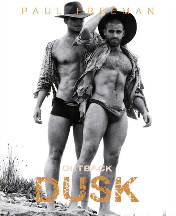

Inevitably I will choose a somewhat sensible middle ground. I like all of the titles enough- heck I invented them- and lucky for me the image I suspect makes the strongest cover, fulfilling most print cover criteria, is also evocative of at least some of the books themes, but more importantly, this time, it is far and away the most popular choice so far, even if one close girlfriend looked at me curiously when I showed it to her , and asked “ what made you decide to put this in the mix?”! To negate this reaction I will have to content myself that she didn’t ‘get it’ for some reason, the way others do, and as my readership is still, unfortunately, only roughly ten per cent female, and though greater accessibility to the female population has long been a core objective of mine, if she represents her gender in any way, then that will have to wait even longer.
It’s all a lot to pressure about a cover, and there is a lot to expect of a cover, and no one choice is going to be all things for all people 100% anyway, and, as with everything else to do with creating a book, decisions, imperfect as they may be, have to be made. I know, as the creator and the publisher of the book, the buck stops with me and it is decision time.
But just to be sure, which way do you think I should go?